I have redesigned the logo for Anglo Forma, a company who offers English language courses for businesses and individuals in France.
The purpose of the logo redesign was to raise the profile of the business, to compete with large language classes, and to represent an established business in order to become a known name for the English language market in France. The company aim to teach confidence in communication and promote ‘the joy of communication’ with a very fresh and personalised approach. It was important that the new logo design looks professional, yet fun to stand out from the competition.
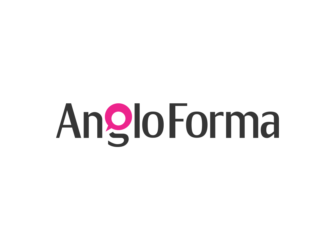
The final design exudes confidence and professionalism. To add an element of fun, the letter G has been transformed into a speech bubble, to convey language training. The central circle, whilst giving the letter its form, symbolises a globe to create a hidden message of ‘talking to the world’
The client was very happy with the design, providing the following testimonial:
It has been a very pleasing experience to work with Ian Paget (Logo Geek), and I am delighted with the final logo. Ian’s methods are efficient and simple for the client, he is attentive to client requirements and tastes, and his work is imaginative and very well thought out. Our project took about two weeks from initial contact to final payment and reception of all the necessary files, together with very helpful guidelines for their use. I am convinced that this new image will have a major impact on moving my business forward.
Kathryn Bohme | Anglo Forma
If you are a language training company and would like a logo designed for your business, do not hesitate to contact me, or take a look at my logo design portfolio for more examples of my work.