When working with typography, kerning is the term used to describe the space between two individual characters within a font. In logo design getting the kerning right is paramount as it makes the difference between looking professional, and having a logo that’s ‘not quite right’.
The kerning applied automatically by a design program is typically satisfactory when used within a block of text, however when applied to a logo, since a small number of characters are used in isolation the kerning needs to be applied manually to ensure it looks perfect.
In the below image I show a comparison between automatic and manual kerning to show the visual improvement slight tweaks can make to typography.
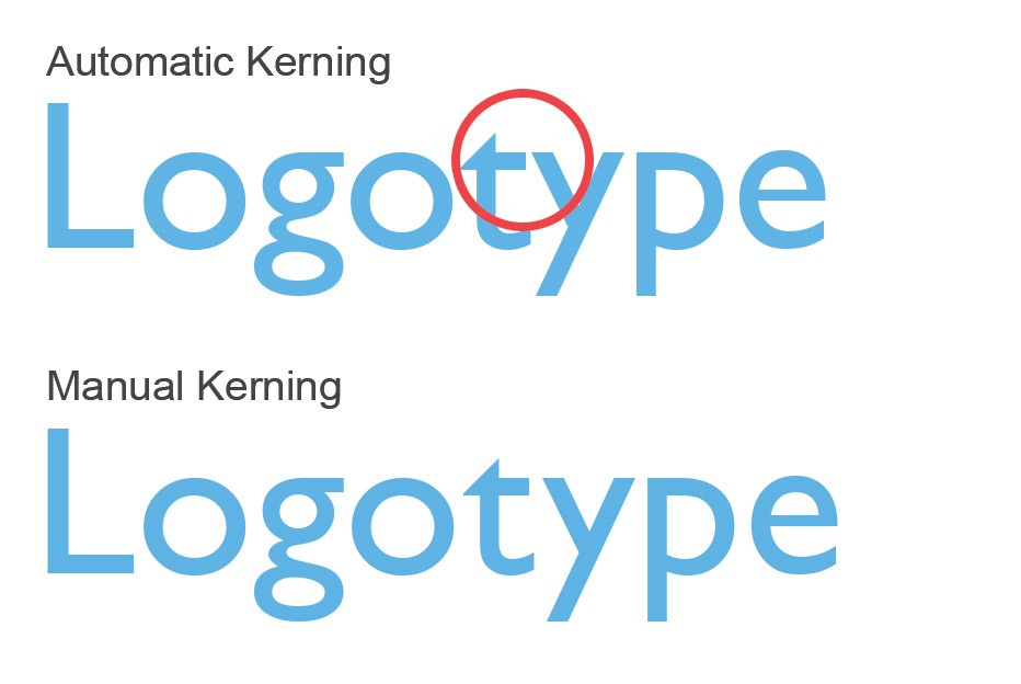
As you can see in the image above, the kerning automatically applied to the ‘t‘ and ‘y‘ looks too tight. By fixing this manually the typeface looks more visually appealing.
How to apply perfect kerning to a logo?
The best kerning tutorial that I have come across is from a chapter within a typography course by a Lettering Artist & Type Designer Sean McCabe called Learn Lettering. Since watching this tutorial I’ve never been able to look at fonts in the same way. This course is the best typography training resource I’ve found online so highly recommend other graphic designers to watch.
Aside from the above video, here are a few other useful techniques.
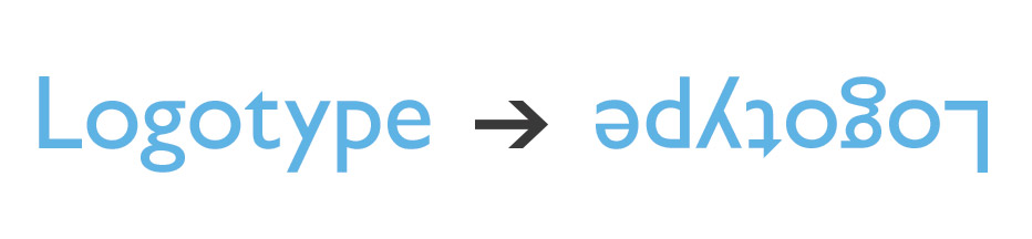
Flip your design upside down
It’s easy to miss errors when working with typography since words are ‘readable’. When working on a logo design, if you flip the design upside down you’ll see kerning errors which you may have normally missed.
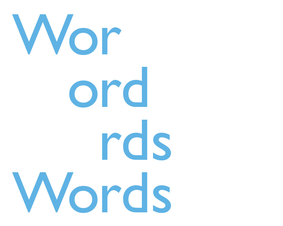
Kern letters in groups of 3
Breaking a word down into blocks of 3 allows you to focus on the detail. When looking at a long word its too easy to be distracted and look at the whole picture, rather than focus on the fine-tuned details. The devil, as they say, is in the detail.
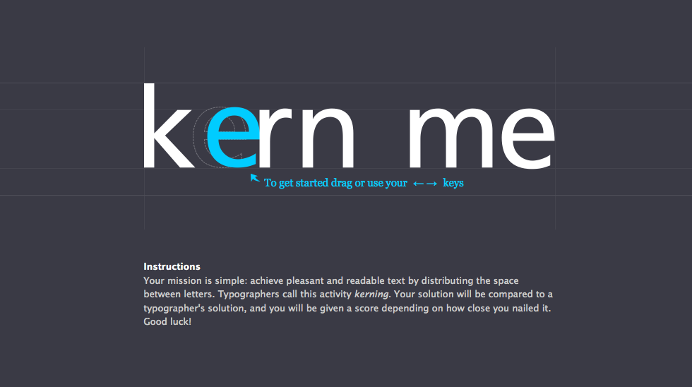
Play a kerning game
Good Kerning takes practice, so what better way to improve than by playing a game. Kerntype allows you to move a character into position, then will compare and score you repositioning based on a typographer’s solution. The closer the position, the higher the score.
Do you have any kerning tips and tricks? Reach out to me on twitter or send an email as I’d love to hear from you. Alternatively, if you’re looking for a custom logo design, please be in touch as I’d love to help create your new business identity.