A new logo design has been created by Ian Paget of Logo Geek for Mi-Media, a creative design and print agency based in Reading. The company approached Logo Geek to design the new identity, which would allow it to reach a larger audience.
About Mi-Media
Created by Tony Charles, Mi-Media was developed during his period of time on the Peter Jones Enterprise Academy.
The business model is very different to other design agencies of its type; Instead of relying on an in-house design and development team, the business works as a network of freelance designers, developers and marketing experts are known to the company as ‘the talent loop’. This unique model allows the company to keep overhead costs down, and in turn, pass this saving on to its customers.
Creating a marketing concept
A logo is part of a whole brand identity. It’s not about looking good on its own, but working in harmony with everything connected. For this reason, I created the marketing concept “Mi-Media – Power your creative vision“.
The concept throws a message out to both freelancers who want to power their own business with paid work, as well as companies that need creative talents to power their own company vision.
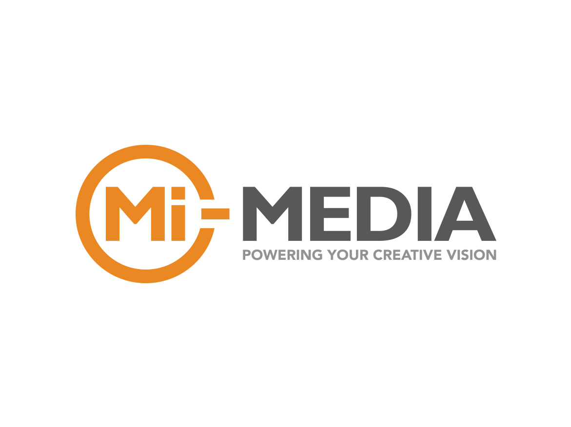
Designing the Mi-Media logo
The company already had an established website in place, which was very clean and corporate, yet made use of a coloured strip, which was broken down into different colours such as purple, red, orange, yellow, green etc. I was very keen to maintain this look and feel for the new logo, so it could simply drop in place on the website.
The company faced the problem since the company name is not unique, other than the exemption of the dash. For this reason, to assist with growing recognition of the brand name with the dash included, I was keen to include the dash itself within the final logo design.
The final logo, presented on the right is simple, yet corporate and professional in appearance. It works in harmony with the current website, and also integrates the dash into the name.
The main driving force of the new logo design is to include the marketing concept mentioned above, “Mi-Media – Power your creative vision”. I was able to integrate the dash from the company name into the logo, whilst cleverly introducing a power icon to the logo to further enhance the new tagline.
To introduce the different colours from the website, the coloured ‘power icon’ can be modified when required. For example, the business offer services such as web design, logo design, illustration and video – a different colour can be used for each division in the company, to own its own identity accordingly.
Upon presenting the logo design, the reaction was very positive: “That’s it! Now we’re ready” – so the power button was hit, and the rest, as they say, is history.
To see more examples like this, take a look at my logo design portfolio.
![]()
![]()
![]()